Website care
How to resize website photos without blur
An image has two sizes: its width and height in pixels, and the amount of data in the file. Reduce unnecessary data while keeping enough pixels for where the photo appears.
The whole process, at a glance
- Choose the display size1 of 3
- Resize and compare2 of 3
- Check the delivered file3 of 3
Before you start
Keep the original photo. Work on a copy and confirm you have permission to publish it. Ask your designer how wide the image will display and whether the website already creates responsive versions.
A practical example
| Measurement | What it answers |
|---|---|
| 1,200 × 800 pixels | How much image detail is available? |
| File size in KB | How much data must download? |
| 600 pixels displayed | How large does it look on this page? |
| Responsive source | Which file did this device actually load? |
Follow these steps
Start with the intended display width
A 600-pixel-wide card does not usually need the full 6,000-pixel camera original. A 1,200-pixel version can provide a useful starting point for a 600 CSS-pixel display on a high-density screen. This is an example, not a universal size rule. A full-width hero, a small thumbnail, and a close-up need different choices.
Resize a copy in Squoosh
Open Squoosh and select a suitable non-sensitive image. In its edit controls, enable Resize, keep the aspect ratio linked, and enter the target width. Check the resulting height. Do not enlarge a tiny original and expect missing detail to return. Crop intentionally instead of squashing the proportions.
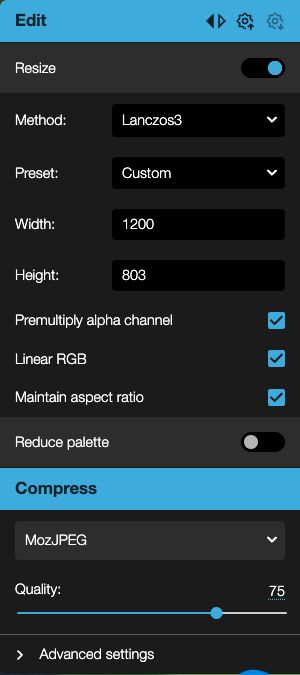
Actual Squoosh controls, captured September 6, 2026 using the app’s built-in sample. The sample’s height becomes 803 pixels at 1200 pixels wide. Keep Maintain aspect ratio checked; your height depends on your original. Source: Squoosh · Apache 2.0. Select the image to enlarge. Compare compression at a realistic size
Try WebP or a suitable JPEG setting for photos. PNG can be useful when transparency or crisp graphics matter. Move the comparison slider and inspect fine details, faces, text, and smooth color areas. Lower quality until damage becomes visible, then back off. There is no single correct quality number or file-size limit for every photo.
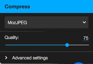
Start with a moderate quality setting, then inspect the photo. This example uses MozJPEG at 75; the right value depends on your image. Actual Squoosh interface, September 6, 2026. Select the image to enlarge. Download the chosen version
Use the download control for the edited side. Check the filename, format, dimensions, and file size before uploading. Keep the original separately. Repeatedly opening and resaving a lossy image can reduce quality; make new exports from the original when you need a different size.

Use the download button on the edited side. This built-in sample became 118 kB after resizing and compression; your result will differ. Actual Squoosh interface, September 6, 2026. Select the image to enlarge. Check what the website really serves
After uploading, look at the page on desktop and mobile. Your builder may create several sizes automatically. An implementer can inspect the image’s
currentSrcand the browser Network panel to check the actual requested file. A smaller-looking image is not necessarily a smaller download. Confirm that responsive variants, crop, alt text, and layout dimensions are appropriate.
You’re finished when…
The image looks sharp at its actual display size, the page downloads a suitable version, and the untouched original remains available.
If you get stuck
Should I change DPI for the website?
For this task, pixel dimensions and the displayed size are the useful measurements. Changing a print-resolution number alone does not solve an oversized web download.
Why is a small file still blurry?
It may have too few pixels, too much compression, or a soft original. Go back to the original rather than increasing the export dimensions.
My builder already optimizes photos
Use its documented image recommendations and check the output. Avoid extra manual compression if it only makes the source worse.
Official sources and further reading
- Squoosh: official application
- Squoosh: source and documentation
- web.dev: responsive image delivery
- MDN: image currentSrc
Reviewed September 6, 2026. Platform menus can vary by account and change over time. Examples and checklists are WinflowAI’s own guidance; follow the linked vendor instructions for your account.